CONTRAST MOTION GRAPHIC
This motion graphic was a group project created to teach the design principle of contrast to first-year foundation students. I served as the art director —designing the visual frames, writing the script, shaping how each clip visually explained the concept, and recording the voiceover.
Sr Designer: Aubrey Jefferson
Jr Designer: Michael Hayden
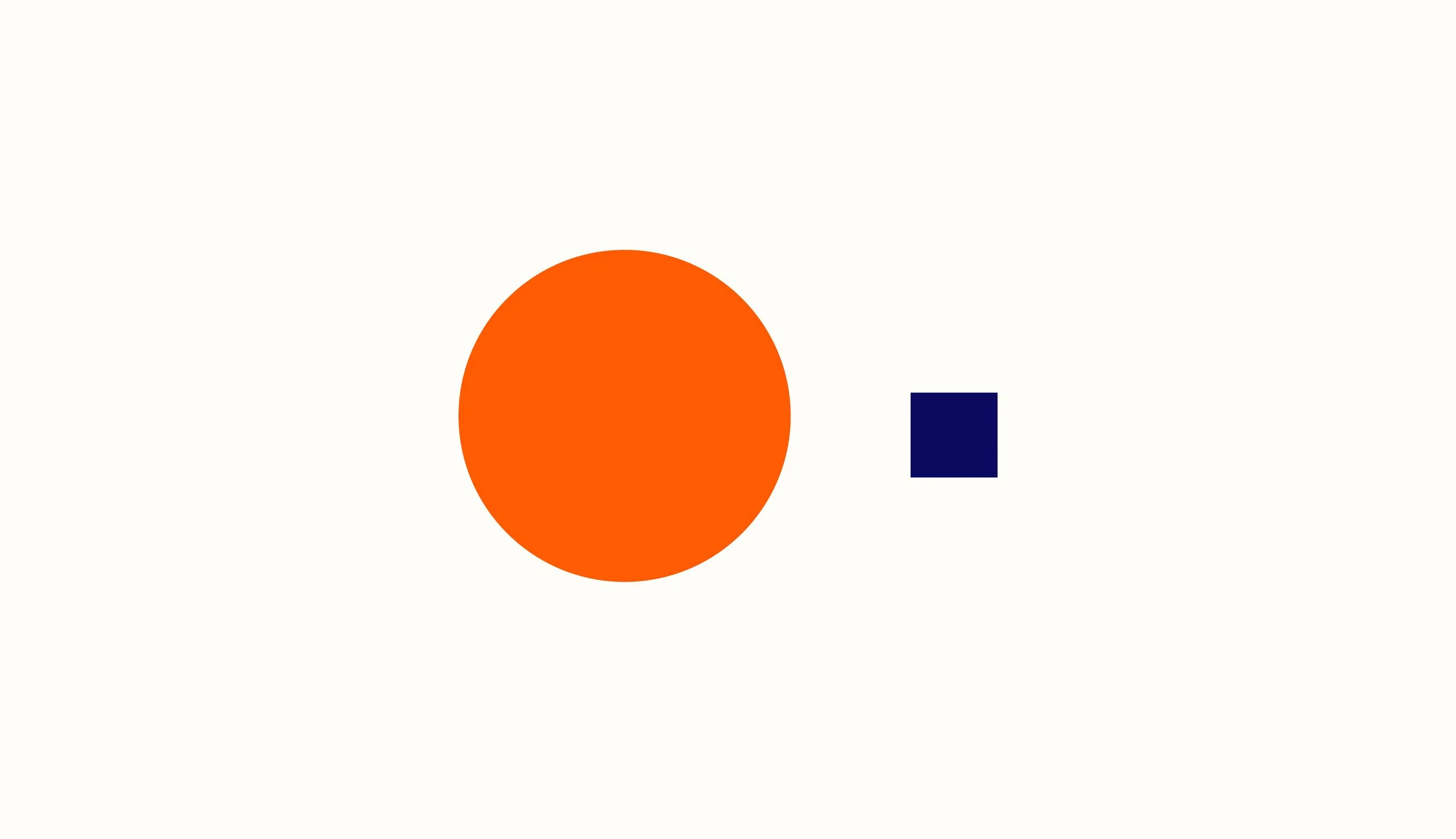
The visual language of this video uses simple shapes—like circles and squares—to support the information in the voiceover. These basic forms keep the visuals clear and easy to understand, which is helpful for students who may be new to design. The simplicity makes the concept easy follow without distracting details.
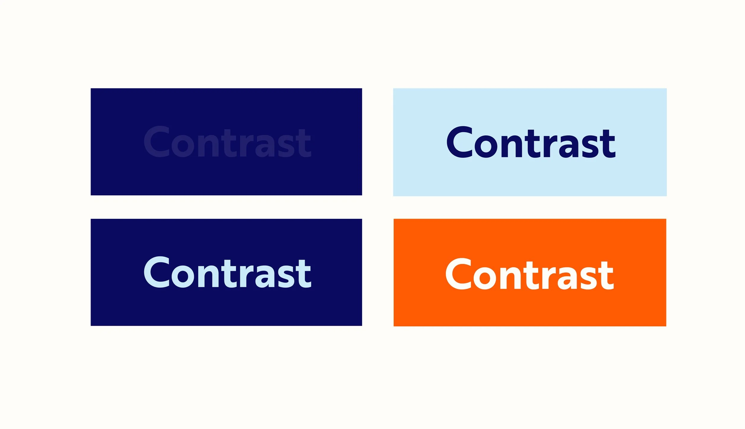
For this video, I made sure the color palette demonstrated strong contrast to reinforce the idea that good contrast improves readability and clarity. The animation begins with a poor color combination and transitions to a better one to highlight the importance of choosing colors intentionally.
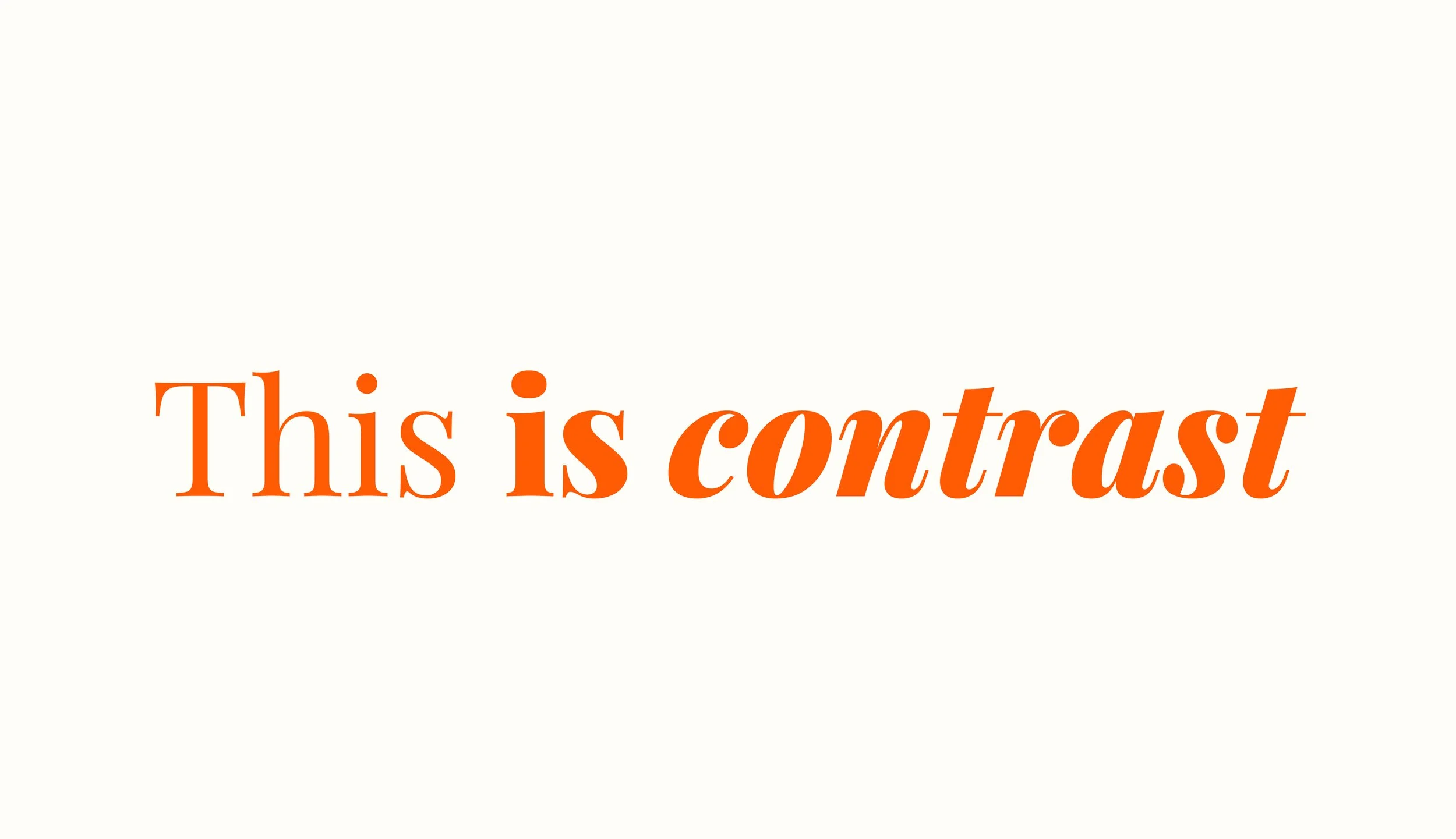
Since the audience for this video is first-year art & design students, they may not be familiar with design terminology. In the script, I use the word “text” instead of “typography” to keep the language accessible. We then demonstrate contrast by changing the weight and style of a font to show how emphasis can be created.